Level: ⚫⚫⚫⚪⚪ Advanced
Requirements
- Local copy of the MAgPIE model (https://github.com/magpiemodel/magpie)
- Have R installed (https://www.r-project.org/)
- Have R packages
madrat,magclassandluplotinstalled
Content
- Know how to generate and where to find spatially explicit output data (NetCDF & magclass-format)
- Data visualisation with the Panoply NetCDF Data Viewer
- Learn how to make animated time series with output data
- Use the
luplotpackage for spatial visualisation of magclass objects in R
Overview
Introduction
In the previous tutorial, we have learned how to analyse MAgPIE results at the regional scale. The next step, covered by this tutorial, is the analysis of spatially explicit output data at the 0.5 degree level. We therefore build on knowledge covered by the previous tutorial on how to access the output folder of your local MAgPIE version. If you are unsure, how to access the output folder, or if you have not yet conducted a MAgPIE simulation, please, have a look at the previous tutorial(s).
MAgPIE itself does not operate at the 0.5 degree level, yet many procesess like land competition, agricultural production or irrigation are based on input data at the 0.5 degree grid cell level, which is aggregated to spatial simulation units (clusters) in order to address computational constraints.
Disaggregation scripts
After optimisation, some of the model outputs can be disaggregated back to the 0.5 degree level via dedicated disaggregation scripts that can be found under "<your MAgPIE folder>/scripts/output/extra". In the default MAgPIE configuration only the script "extra/disaggregation" is selected via cfg$output:
cfg$output <- c("output_check", "rds_report", "validation_short",
                "extra/disaggregation")
However, other scripts can be added by changing cfg$output before conducting a model run, e.g. by adding "extra/convertToNetCDF". In this example, we add a script that converts spatially explicit results to the common NetCDF format.
cfg$output <- c("output_check", "rds_report", "validation_short",
                "extra/disaggregation", "extra/convertToNetCDF")
Visualisation of spatially explicit MAgPIE output with the Panoply NetCDF Data Viewer
Spatially explicit MAgPIE output is usually stored in the MAgPIE-own magclass-format with the ending ‘.mz’, which is comparably storage efficient. But as shown above files can also be converted to the NetCDF format with the ending ‘.nc’ using the output script "extra/convertToNetCDF".
The script "extra/convertToNetCDF" can also be manually executed after a running the model via the Rscript output.R.
We will first cover the handling and visualisation of spatial ouputs in the NetCDF format by using the NetCDF data visualisation tool Panoply. The magclass-format can be read-in and processed in R by using the R-packages magclass or luplot for visualisation. We will come back to this, however, at a later stage.
Installling Panoply
In order to download Panoply go to the website https://www.giss.nasa.gov/tools/panoply/. Scroll down until you find the header Get Panoply and click on Download Panoply. This will lead you to the following page:
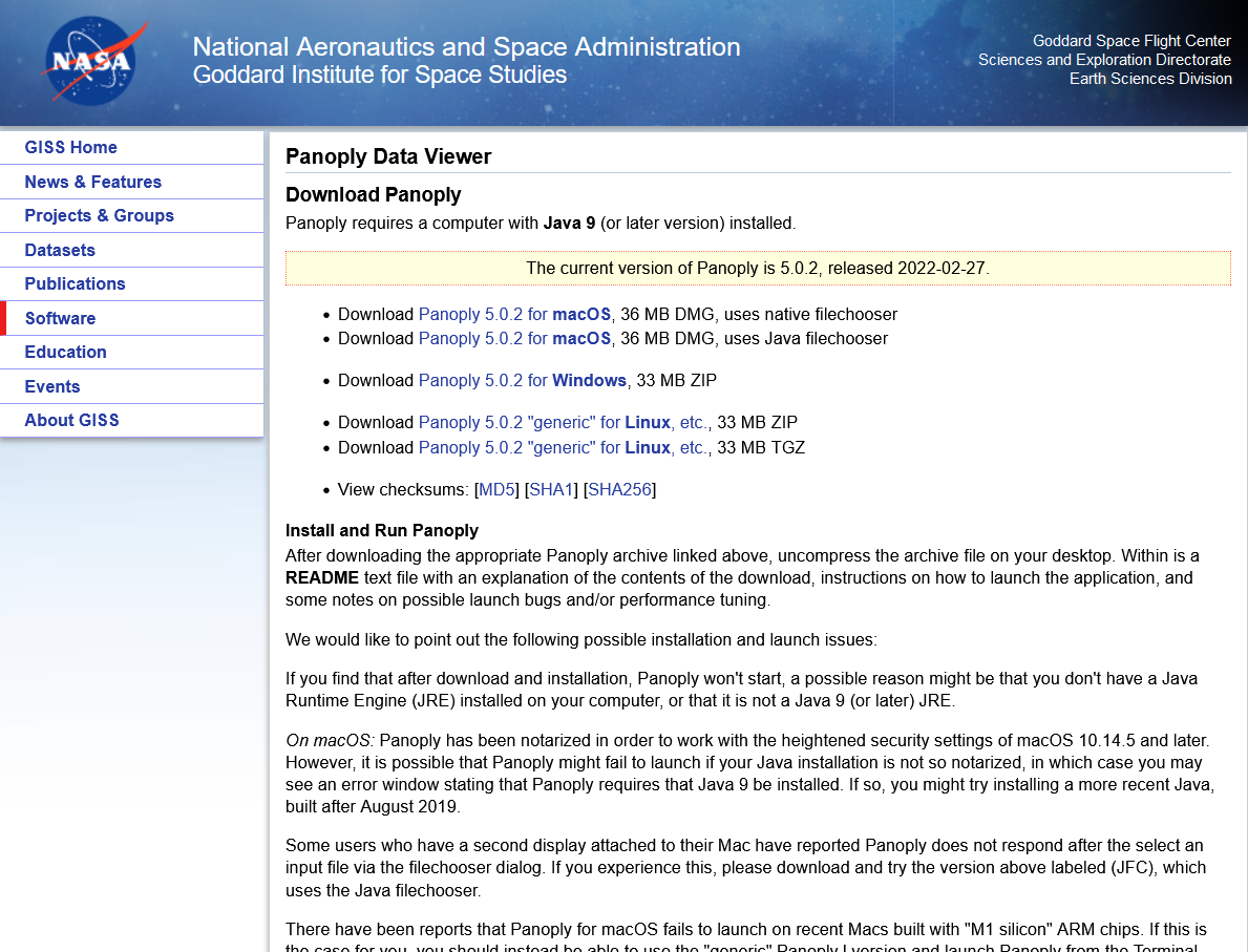
Please, choose the right version for your operation system, select a destination folder and proceed with the download. After the download has finished, follow the instructions for installing Panoply that can be found on the website for your operating system.
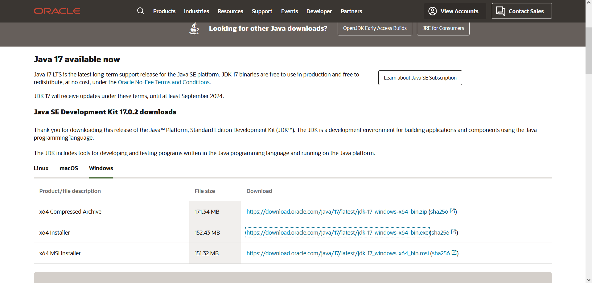
Make sure Java 9 (or later) is installed
If you encounter an error while trying to execute Panoply after installation, make sure you have Java 9 (or later) available on your computer. In case you need to install/update Java, go to the website https://www.oracle.com/java/technologies/downloads/#jdk17-windows and download the appropriate version for your operating system.
Using Panoply to visualise MAgPIE output
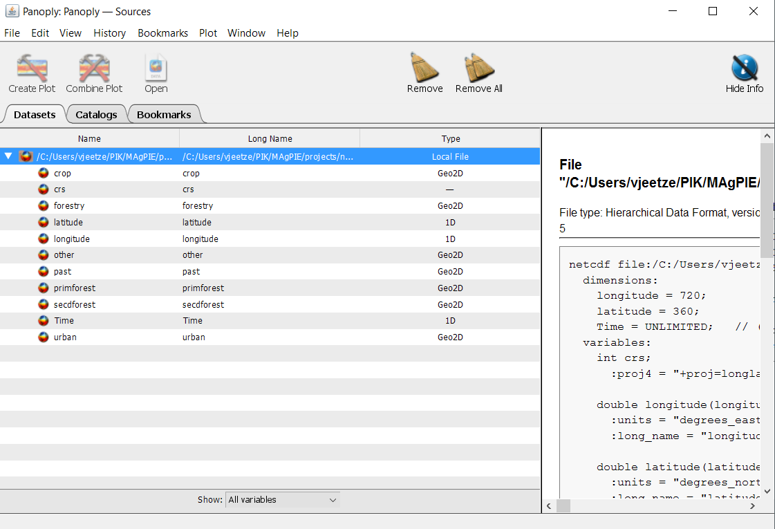
Navigate to the folder, where Panoply is stored and click on Panoply.exe to execute the software. Each time a new session is started in Panoply, a new window opens that allows you to select your data. Navigate to the output folder of your local MAgPIE version and select a subfolder containing the results of a succesful model run. Panoply will display all NetCDF files that are available in this folder.
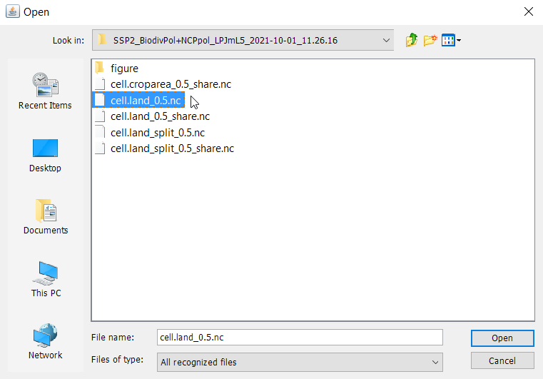
Select the file ‘cell.land_0.5.nc’ and press open. ‘cell.land_0.5.nc’ includes a spatially explicit time-series of the land area (Mha) covered by the different land-types (cropland, pasture, etc.) per 0.5 degree grid cell. We now see a window that lists all information that is stored in this file, including the names and the type of data that are available. We can also look at the panel on the right-hand side to see some meta data, e.g. the units.
We can now select the item ‘crop’ by left-clicking it. Then click Create Plot, accept all defaults and press Create. This will create a plot similar to this example:
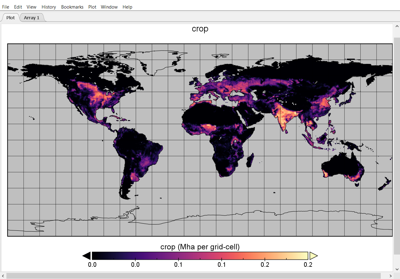
The plot shows the cropland area in each grid cell given in Mha. Panoply also allows us to perform basic calculations and plot them. Now, let us compute the difference in cropland area per grid cell between the initial time step and 2050.
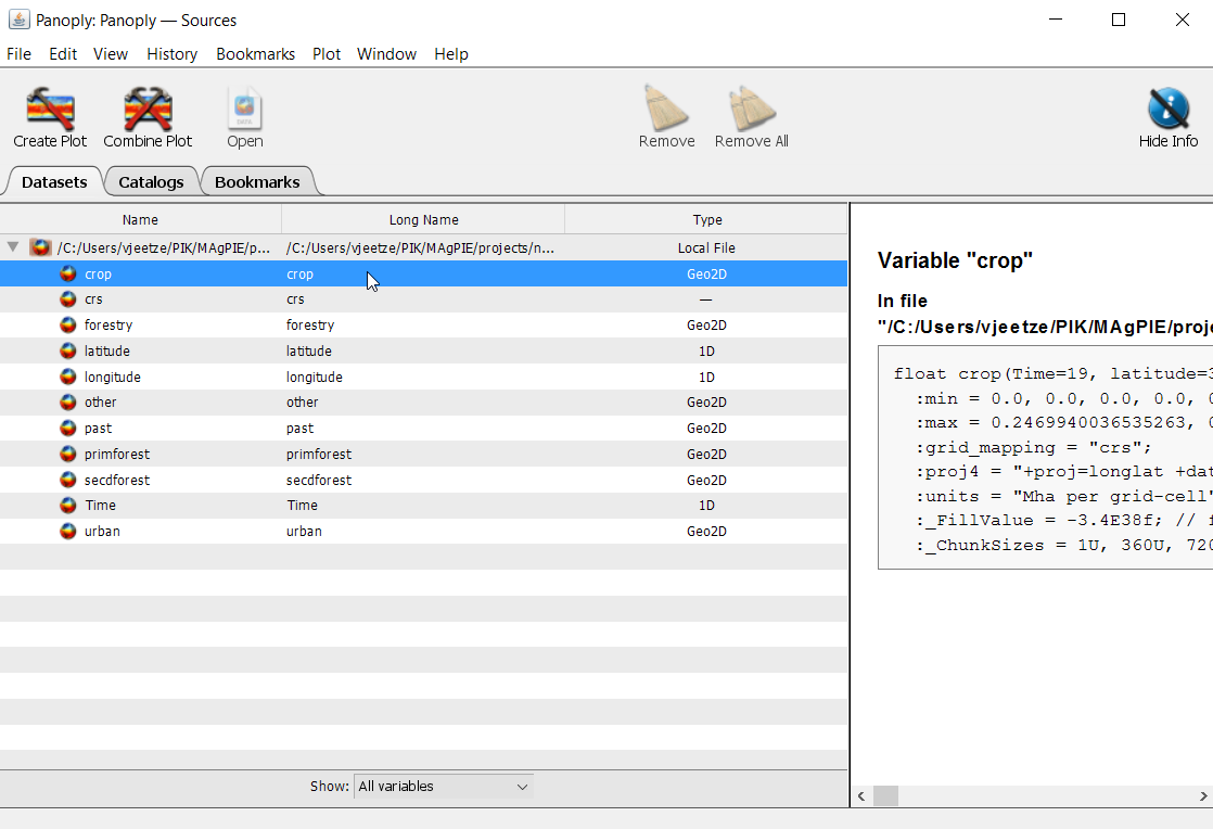
We go back to our data window and click on ‘crop’ once again.
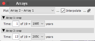
But instead of pressing Create plot, this time we click on Combine plot. We now find two array tabs on the top left-hand side. Also, Panoply will prompt the Arrays-window for us. Under Plot select ‘Array 2 - Array 1’ and select the year 2050 in Array 2: crop, as shown below, and hit ‘Enter’.
We can also change the appearance of the plot by reprojection the map to a different coordinate reference system (CRS), or by changing the color scale.
In order to change the CRS, we can open the window Map Projection via
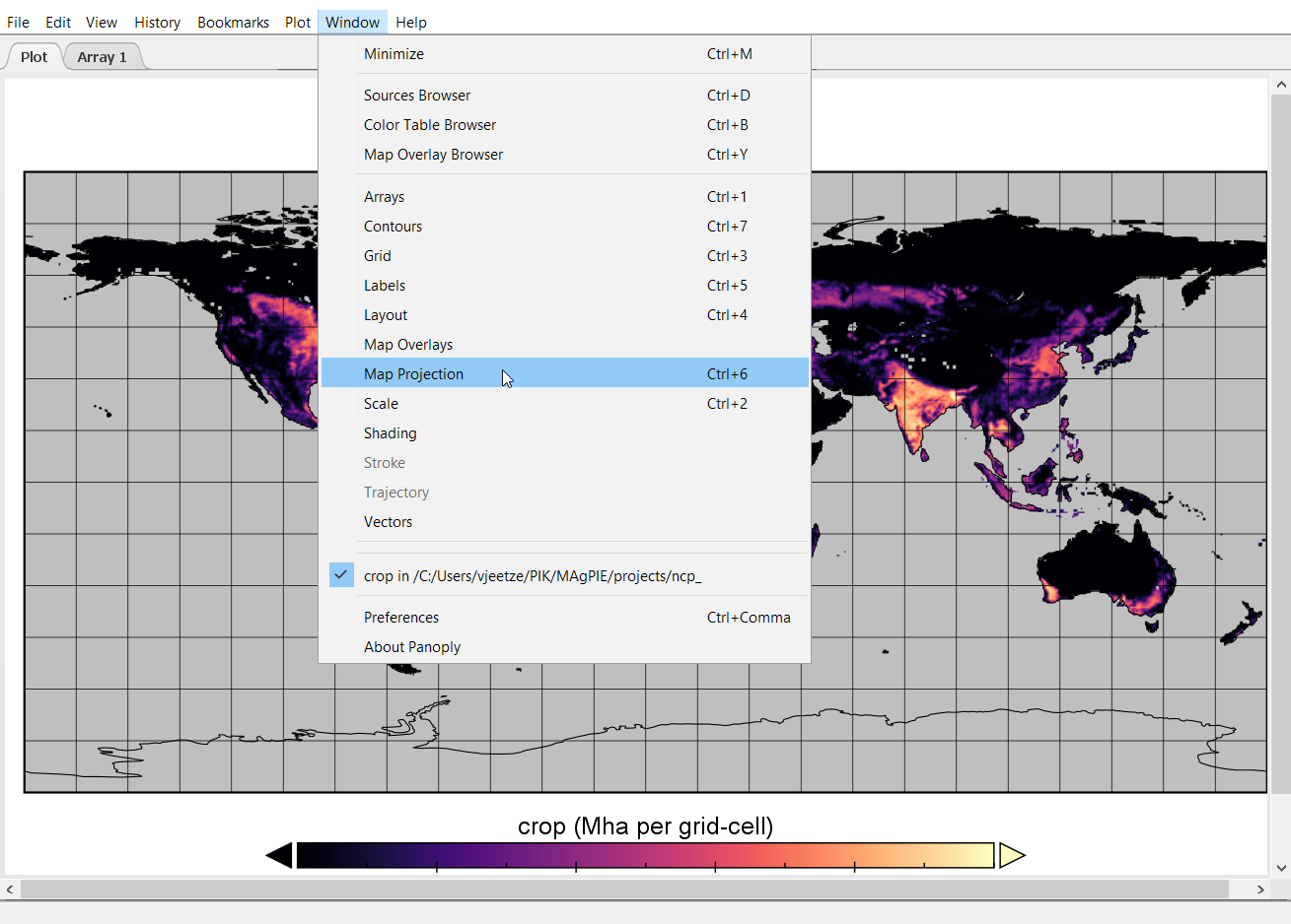
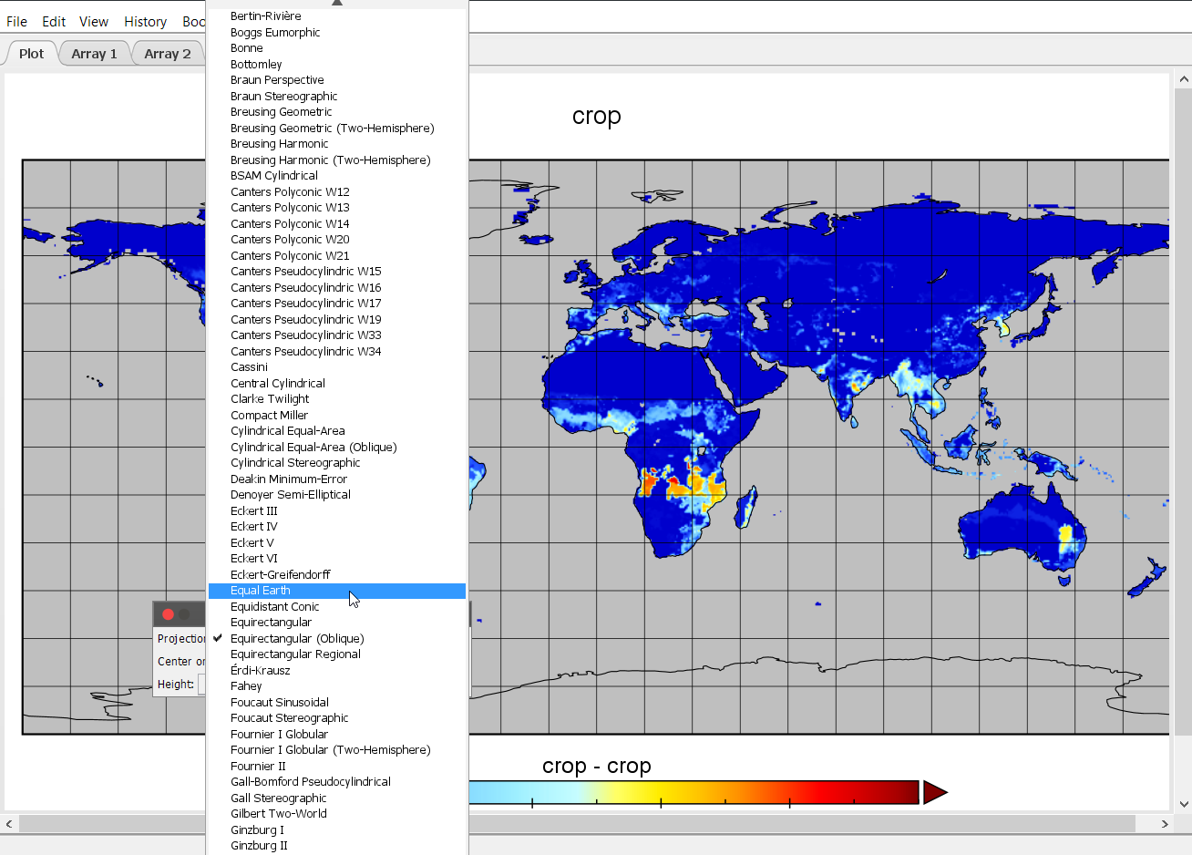
and then, for example, change to the ‘Equal Earth’ projection by clicking on the Projection drop-down menu in the Map projection window.
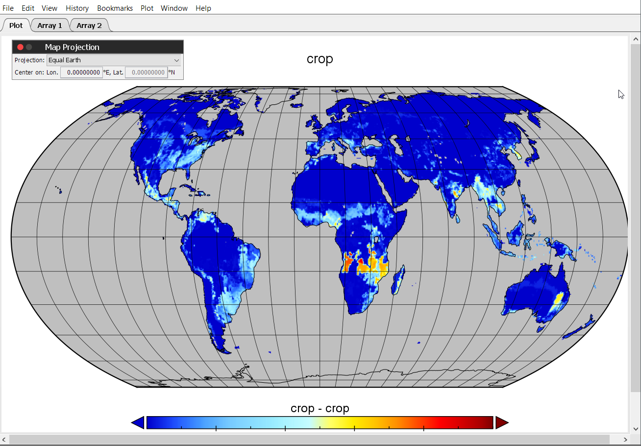
After changing the CRS, the map looks like this:
Now let us improve the looks of it a bit and work on the color scale. Therefore, select the option Scale under Window.
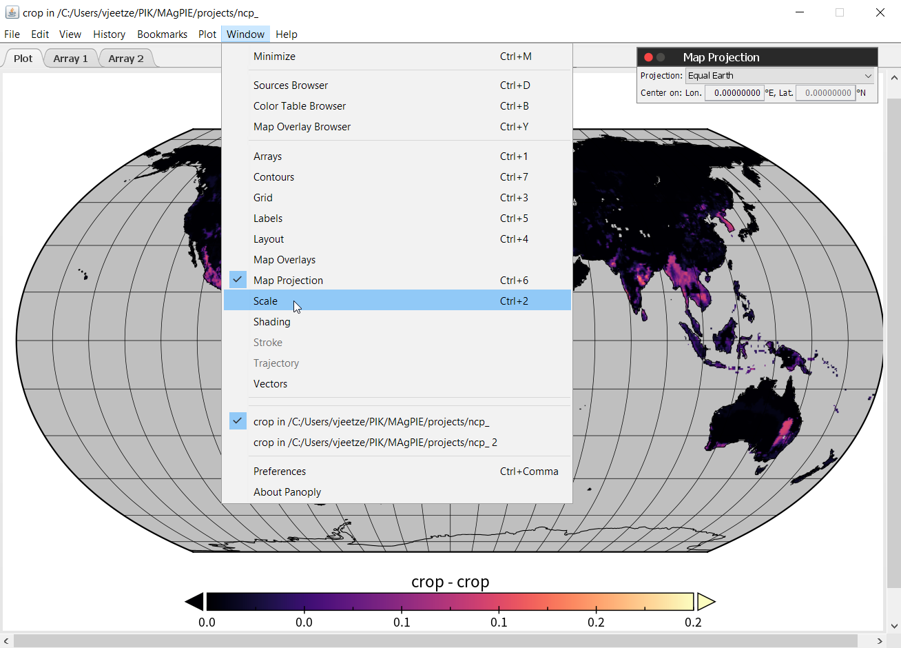
This will open the following window, where we can tweak a range of map properties.
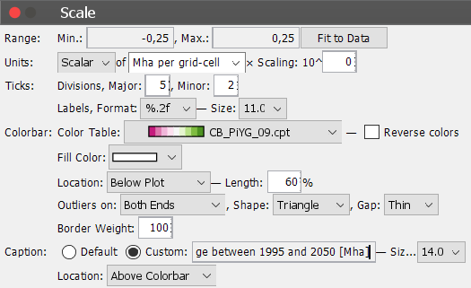
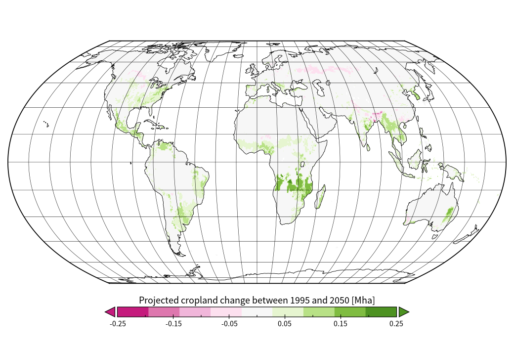
We can set the range of the legend to [-0.25; 0.25] and select the color bar ‘CB_PiYG_09.cpt’ or any color bar to your liking. However, consider that this is a change map and using a neutral color like grey or white in the center of your color range is recommended to facilitate the interpretation of the data. Also set the label format to ‘%.2f’. This will change the legend label format and provides us with two decimal places behind the comma. We can also add a custom caption by selecting Custom and enter a suitable text. Under Window -> Label we can also change/remove global plot labels. In the end out plot looks like this:
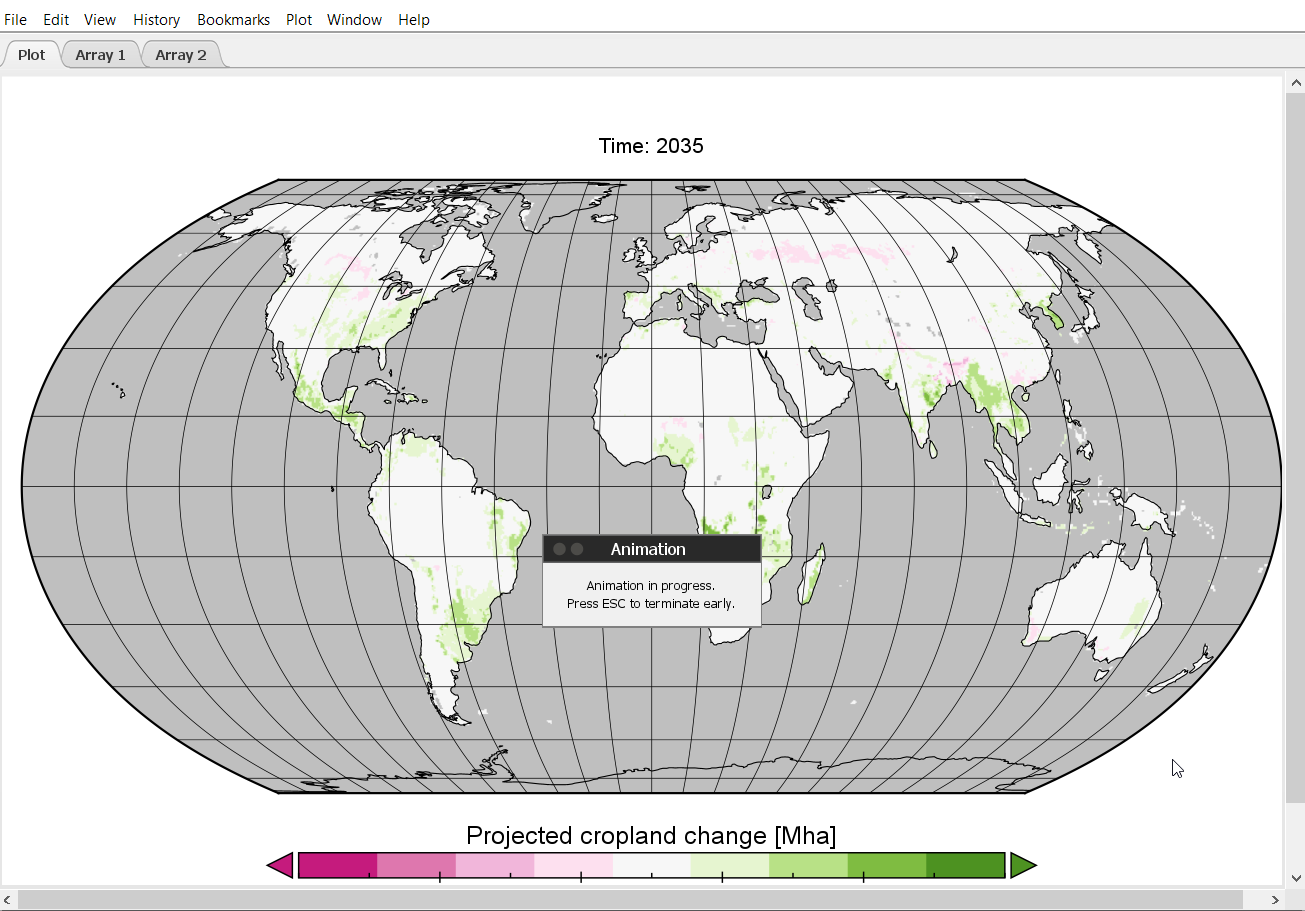
Creating an animated time series based on MAgPIE projections using Panoply
Panoply can also be used to create an animated time series (e.g. in MP4-format) based on spatially explicit MAgPIE projections. In the following, we will create an animated time series of changes in cropland area per grid cell, based on the map that we have created in the previous steps.
To create an animation go to Export Animation.
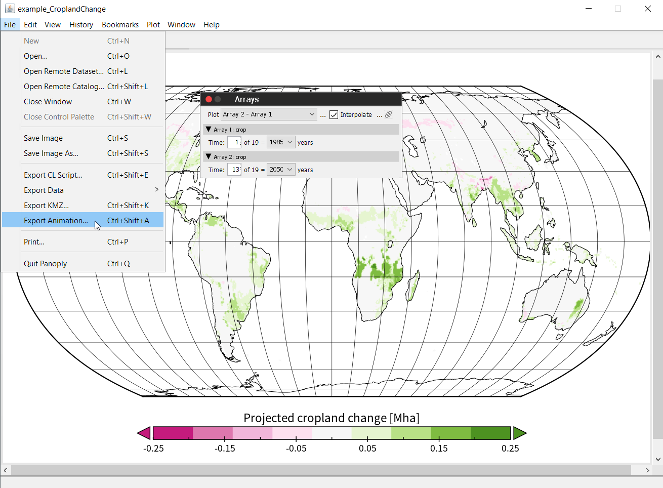
This will open up the following window:
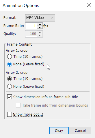
In order to display relative changes, set Array 1: crop to ‘None (leave fixed)’ and select a frame rate of e.g. 1 fps, then click on Okay. Choose a file destination, choose a file name and press Save. Panoply will now create an MP4-animation of the complete time series.
Analysis of spatial outputs in R using the magclass and luplot libraries
For further analysis and processing of spatial MAgPIE projections beyond visual interpretation, spatial outputs can be imported and analysed in R using the packages magclass (https://github.com/pik-piam/magclass) and luplot (https://github.com/pik-piam/luplot). magclass provides a range of tools for handling MAgPIE’s own magclass-format (ending ‘.mz’) for storing spatio-temporal data. The magclass package also includes a vignette that describes the functionality of the package, including examples on how to handle spatio-temporal MAgPIE data.
We can make ourselves familiar with the maglcass package by opening an R (R Studio) session. Find the output folder of your local MAgPIE version and set the working directory to the subfolder containing the results of a finished model run.
setwd("/path/to/your/magpie/output/subfolder")
We can call the library and look at the help pages:
library(magclass)
?magclass
In order to get an overview of the functionality, we can click on the index and look for helpful functions, e.g.
read.magpie and navigate to the help/documentation page, by clicking on it.
We can now try to read in ‘cell.land_0.5.mz’ by typing
x <- read.magpie('cell.land_0.5.mz')
Then we can use str(x) to find out how the data is structured in x. We can analyse x and perform a range of calculations. Data dimensions in magclass objects are indexed in the following three-dimensional form
x['<cell>', '<time>', '<data>']
For example, we can compute the difference in the primary forest (‘primforest’) area in all grid cells between 2015 and 2050:
primforestDiff <- x[,'y2050', 'primforest'] - x[,'y2015', 'primforest']
We can also compute the difference for all land classes simultaneously by typing
allDiff <- x[,'y2050',] - x[,'y2015',]
Now, let us load the library luplot and look at the help pages:
library(luplot)
?luplot
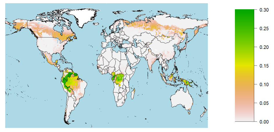
The library contains helpful functions for plotting magclass objects in different ways, e.g. plotmap that transfers data stored in a magclass object to a simple map. However, we cannot plot all data at the same time. Therefore, we need to select a time step and a variable that we want to look at. Here, we choose the year y2050 and the variable primary forest again. In plotmap can also define the upper and lower boundary of the legend via legend_range.
luplot::plotmap2(x[,'y2050', 'primforest'], legend_range = c(0, 0.3))
Exercises (click on the arrows to uncover the solution)
Read the file `cell.land_0.5.mz` from the MAgPIE output folder into R and assign it to an object `x`
x <- read.magpie('<path-to-output-subfolder>/cell.land_0.5.mz')How many 0.5 degree grid cells, time steps and land use types does the object `x` contain? Also use `magclass::getComment()` to find out in which unit the data is stored.
Find out how many 0.5 degree grid cells, time steps and land use types
xcontains by usingstr(x). You will find out that for default runsxcovers 59199 grid cells, 19 time steps and 7 land use types.magclass::getComment(x)gives'unit: Mha per grid-cell'Calculate the difference in cropland area per grid cell between 2015 and 2050 and store the difference in an object called `cropDiff`.
cropDiff <- x[,'y2050', 'crop'] - x[,'y2015', 'crop']Plot the difference in cropland area per grid cell between 2015 and 2050 using `luplot::plotmap()`. See also `?plotmap` for further plotting options.
luplot::plotmap(cropDiff, legend_range = c(-0.25, 0.25))
Regional output analysis Overview Creating a new realization